)
)
)
La versión en español del logotipo del 200.º aniversario ya está disponible
El logotipo oficial del 200.º aniversario de la Fundación de la Primera Casa de la Misericordia de Catherine McAuley en el 64A de Lower Baggot Street, Dublín, en 1827, fue presentado por la Asociación Internacional de la Misericordia (MIA) el pasado mes de febrero.
Al comentar sobre el logotipo, Mary O’Donovan, directora ejecutiva de Mercy International, dijo: “El logotipo del 200.º aniversario de Mercy ocupará un lugar central en nuestra campaña del bicentenario. El logotipo celebra la visión de Catherine McAuley de valentía, compasión y amor práctico: una visión que continúa inspirando y guiando al Mundo de la Misericordia hoy en día.
“El logotipo destaca nuestro patrimonio y nuestra historia, al tiempo que renueva nuestro compromiso de responder a las necesidades de nuestro tiempo con confianza y esperanza. Al conmemorar estos 200 años, también miramos hacia adelante, comprometidos a llevar el espíritu de la Misericordia al futuro con fe, generosidad y propósito”.
Diseño del logotipo
El logotipo fue diseñado por Padraig McCormack a partir de un encargo proporcionado por MIA, basado en una serie de reuniones de un Comité del 200.º aniversario que sesionó en 2024/2025 y que incluyó representación de cada uno de los miembros de MIA.
El logotipo como imagen visual
El logotipo del aniversario es rico en significado histórico y simbólico. Catherine McAuley aparece como una mujer laica, representada en azul Misericordia. Su posición al frente y en el centro señala su papel como fundadora y su apertura hacia quienes servía.
Su gesto acogedor refleja el propósito original de la Casa de la Misericordia: ofrecer refugio, educación y dignidad a mujeres y niños que vivían en la pobreza.
Además de representar una bienvenida, la mano extendida de Catherine también denota que ella enviaba a otros hacia la misión.
Hay una hermosa feminidad en Catherine, especialmente en sus rasgos faciales: es un rostro que expresa bondad y misericordia. Catherine fue el epítome de la bondad y la acción, que vio la pobreza a su alrededor en el Dublín del siglo XIX e hizo algo al respecto.
Las dos mujeres de pie detrás de Catherine representan a sus primeras compañeras y la naturaleza comunitaria de la misión de la Misericordia, que rápidamente creció más allá de Catherine sola. Las mujeres también sugieren diversidad, continuidad y las generaciones sucesivas del ministerio de la Misericordia. Los colores de su vestimenta son brillantes y vibrantes.
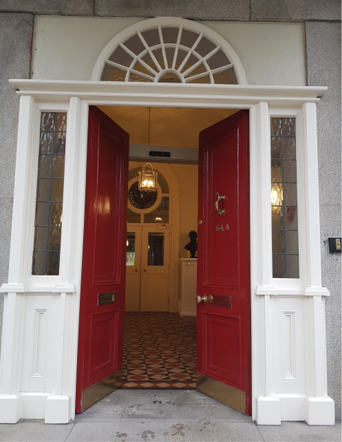
La Casa está representada en las puertas rojas abiertas, con el número 64A claramente visible. La claraboya semicircular representa los rasgos georgianos de la casa.
Texto del logotipo
El texto del logotipo es claro, de modo que, aunque no se sepa nada sobre Catherine o sobre qué aniversario se celebra, toda la información necesaria está ahí mismo en las palabras del logotipo.
Las palabras “Fundación” y “Primera” se utilizan deliberadamente. Fundación tiene más impacto que apertura y también actúa como puente hacia el importante aniversario de 2031 de la fundación de la Congregación de las Hermanas de la Misericordia por Catherine.
La palabra primera también hace referencia a las muchas Casas de la Misericordia abiertas en todo el mundo en nombre de Catherine después de que la primera se abriera en Baggot Street en 1827.
Uso del logotipo
El logotipo está diseñado para utilizarse a todo color.
El logotipo tiene derechos de autor de MIA y no puede descargarse ni reproducirse fuera de las versiones disponibles en el kit del logotipo. El logotipo no puede descargarse ni copiarse para uso comercial.
El logotipo está diseñado para utilizarse a partir de marzo de 2026, mientras continuamos la cuenta regresiva hacia el 24 de septiembre de 2027, fecha del aniversario de la fundación de la primera Casa de la Misericordia.
Todas las consultas deben dirigirse a mercyenews@mercyinternational.ie
The official logo for the 200th anniversary of the Founding of Catherine McAuley’s First House of Mercy at 64a Lower Baggot Street, Dublin in 1827, was launched by Mercy International Association(MIA) last February.
Commenting on the logo Mary O’Donovan, CEO of Mercy International said: "“The Mercy 200th anniversary logo will sit at the centre of our bi-centenary campaign. The logo celebrates Catherine McAuley’s vision of courage, compassion and practical love - a vision that continues to inspire and guide the Mercy World today.
"The logo highlights our heritage and story while renewing our commitment to respond to the needs of our time with confidence and hope. As we mark these 200 years, we also look forward - committed to carrying the spirit of Mercy into the future with faith, generosity and purpose.”
Logo design
The logo was designed by Padraig McCormack to a brief provided by MIA which was informed by a series of meetings of a 200th anniversary Committee which sat in 2024/2025 and which included a representation from each of the Members of MIA.
The logo as a visual
The anniversary logo is rich in historical and symbolic meaning. Catherine McAuley is pictured as a lay woman, depicted in Mercy blue. Her position just to the front and centre signals her role as founder and her openness to those she served.
Her welcoming gesture reflects the original purpose of the House of Mercy: to provide shelter, education, and dignity to women and children experiencing poverty.
As well as representing a welcoming in, Catherine’s outstretched hand also denotes her sending out too.
There is a beautiful femininity to Catherine especially in her facial features - it is a face expressing kindness and mercy. Catherine was the epitome of kindness and action who saw the poverty around her in Dublin in the 1800s and did something about it.
The two women standing behind Catherine represent her first companions and the communal nature of the Mercy mission, which quickly grew beyond Catherine alone. The women also suggest diversity, continuity, and the unfolding generations of Mercy ministry. The colours of their clothing are bright and vibrant.
The House is represented in the open red doors, with the number 64A clearly visible. The fan light represents the Georgian features of the house.
Logo wording
The wording on the logo is clear so even if you do not know anything about Catherine or what the anniversary is – all the information you need is right there in the logo’s wording.
The words ‘Founding’ and ‘First’ are used deliberately. Founding is more impactful than opening and also acts as a bridge to the significant anniversary in 2031 of the founding of the Sisters of Mercy Congregation by Catherine.
The word first is also a nod to the many houses of Mercy opened across the world in Catherine’s name after the first was opened in Baggot Street in 1827.
Use of the logo
The logo is designed to be used in full colour.
The logo is copyrighted to MIA and may not be downloaded or reproduced outside of the versions available in the logo kit. The logo may not be downloaded or copied for commercial use.
The logo is designed to be used from March 2026 as we continue the countdown to 24 September 2027, the anniversary date of the founding of the first House of Mercy.
All queries to mercyenews@mercyinternational.ie.